Intergri5
We designed a graphic identity that shows the concept of the brand in its look.
With a strong presence in the sector, Intergri5 is looking to strengthen even more its place in the market by creating a new identity to appeal to younger audiences.
The main idea for the concepts of this branding came from the name itself; the client said offer she helped rebuild her client's financial portfolios.
We drew inspiration from an existing brand to help develop and rebuild a clean and contemporary brand that showcases how Intergri5 helps rebuild you from the old to the new.
Services
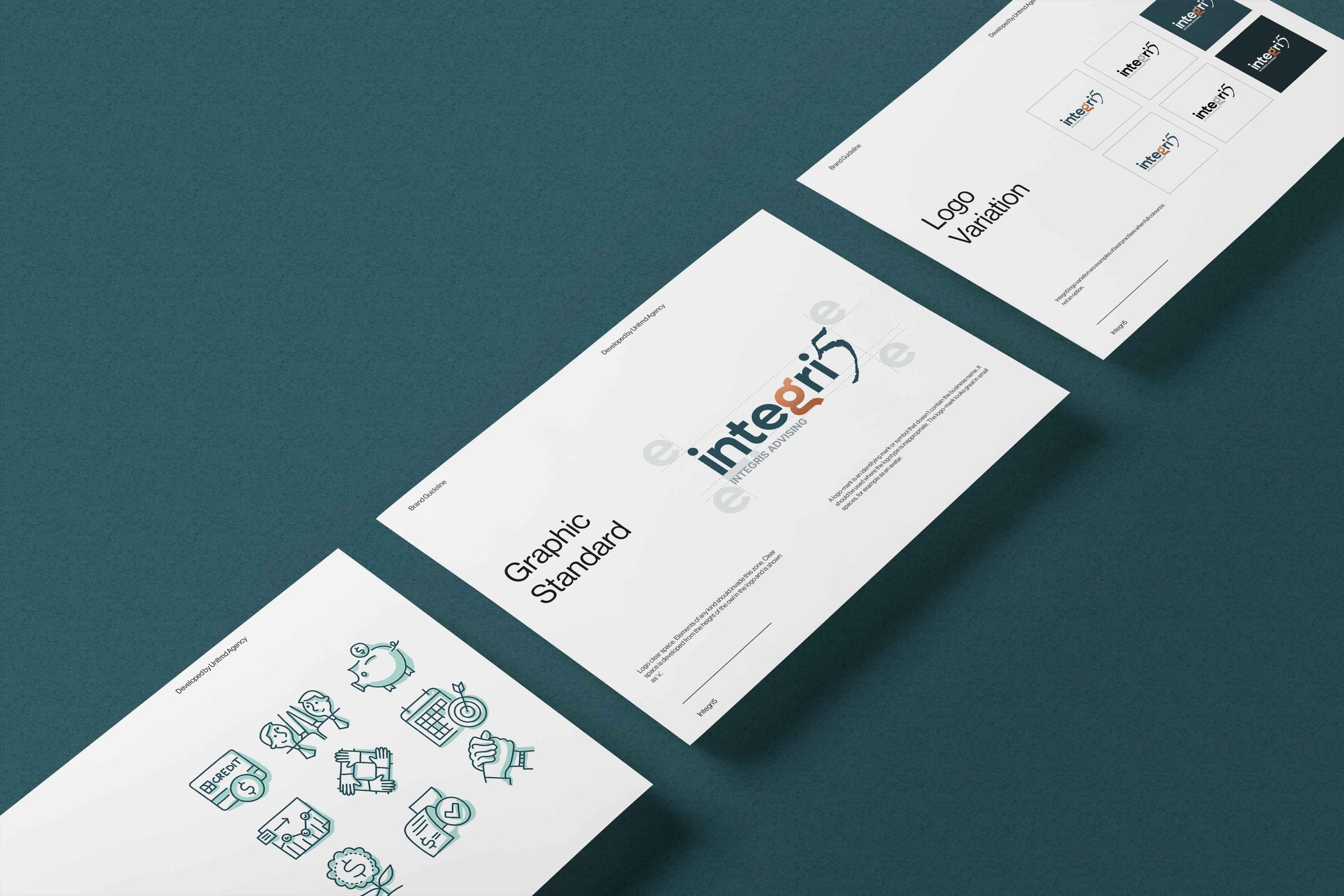
Brand Guidelines
Logo Development
Template Design
Type of Clients
Financial Services
Location
Brisbane

The challenge was to develop a strong and communicative image, that is different from what we are used to seeing but it’s just as credible.
We developed a custom typeface that uses the same curves as the icon. By using the same style in both the icon and the typeface we guarantee that they work well together and are easily recognizable as a whole.
The colours were picked mainly for the digital world, to reinforce the unconventional characteristics of the branding and help distinguish it from the other companies in this sector.