Logo Design for Financial Advisors | Integri5
We designed a Logo Design that embodies the intergri5 brand's essence through visual appeal. With a robust presence in the financial sector, Intergri5 aims to further cement its market position by creating a new identity that resonates with younger audiences. Our approach to logos and branding for financial planners was driven by the brand's core values and the client's vision of rejuvenating financial portfolios.
The primary inspiration for ther branding concept stemmed from the name "Intergri5" itself. The client emphasised their transformative role in rebuilding their clients' financial portfolios, a theme we sought to encapsulate in the new identity. Drawing inspiration from existing brands, we developed a clean and contemporary look that underscores Intergri5's commitment to guiding clients from their past financial state to a renewed and prosperous future.
Our design process focused on creating a visual identity that not only appeals to a younger demographic but also maintains the trust and reliability associated with financial planning. The logos and branding elements were meticulously crafted to reflect a sense of progress and renewal. By blending modern design aesthetics with the core message of transformation, we ensured that the new identity stands out in a competitive market.
Intergri5 is poised to attract a broader audience while retaining its established client base through this revamped identity. The contemporary design elements convey a fresh start and a forward-thinking approach, which are crucial for appealing to younger clients seeking innovative financial solutions. This strategic rebranding effort highlights Intergri5's dedication to evolving with the times and reinforcing its position as a leader in the financial planning sector.
By showcasing how Intergri5 helps rebuild clients' financial futures, our logos and branding effectively communicate the brand's mission and vision, positioning it for continued success in the market.
Services
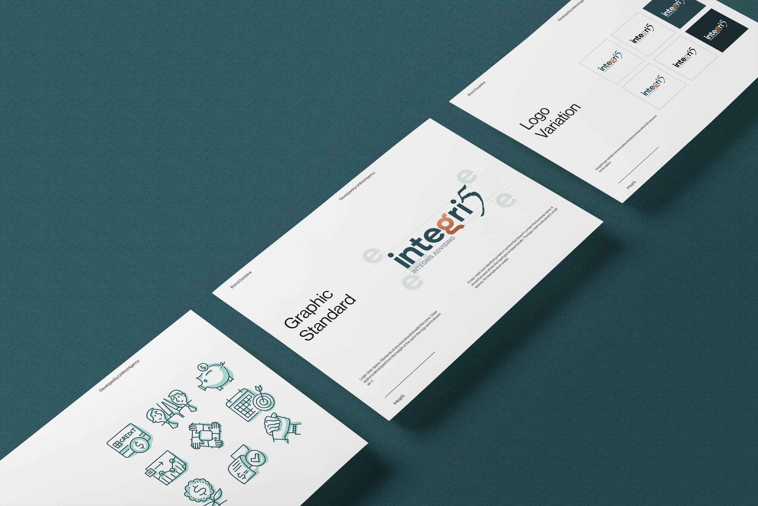
Brand Guidelines
Logo Development
Template Design
Type of Clients
Financial Services
Location
Brisbane

The challenge was to develop a strong and communicative image, that is different from what we are used to seeing but it’s just as credible.
We developed a custom typeface that uses the same curves as the icon. By using the same style in both the icon and the typeface we guarantee that they work well together and are easily recognizable as a whole.
The colours were picked mainly for the digital world, to reinforce the unconventional characteristics of the branding and help distinguish it from the other companies in this sector.