Nonprofit branding and logo design for Assemble Brisbane

CLIENT
Assemble Brisbane
BRIEF
Our nonprofit branding services played a key role in the comprehensive branding solution for Assemble Brisbane. This included creating a new logo, colour scheme, typography, and other visual elements. The branding solution aimed to reflect the initiative's values of collaboration, inclusivity, and creativity and create a strong brand presence that would help it stand out in the market.
Assemble Brisbane is a collective of the Art, Architecture, and Design communities in Brisbane, who gather together to celebrate collaboration and the value that these disciplines bring to the city. This initiative brings together leading education and training bodies, major arts and craft institutions, and representatives from organisations such as the Australian Design Alliance and the Australian Institute of Architects.
The driving force behind Assemble Brisbane is to foster collaboration between and across disciplines, with the upcoming Brisbane 2032 Olympics and Paralympics serving as a catalyst for innovation and creativity. Through non-for-profit branding, Assemble Brisbane seeks to build a strong and cohesive identity that resonates with its mission and values.
SERVICES
Web Design
Branding
Template Design
Monthly Design Services
Examples of Assemble Brisbane - Nonprofit Branding Elements
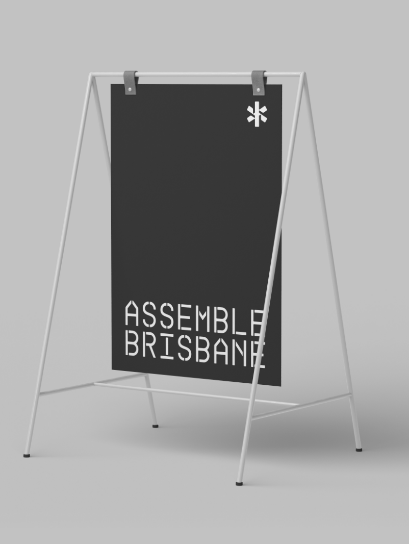
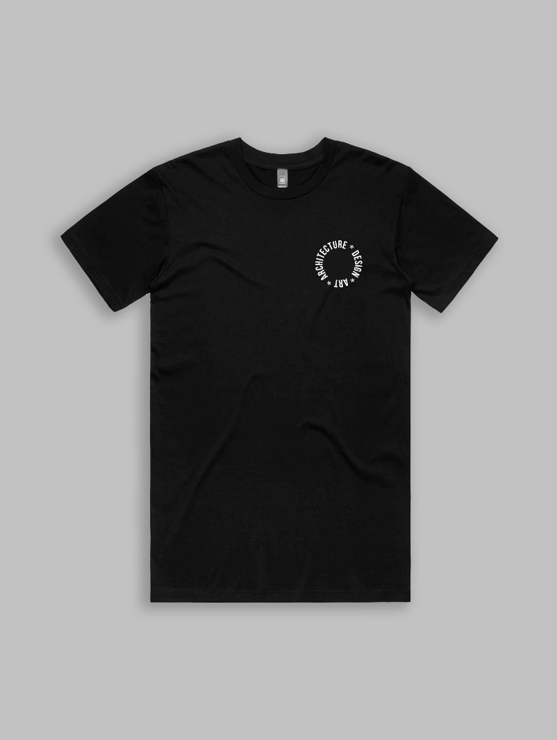
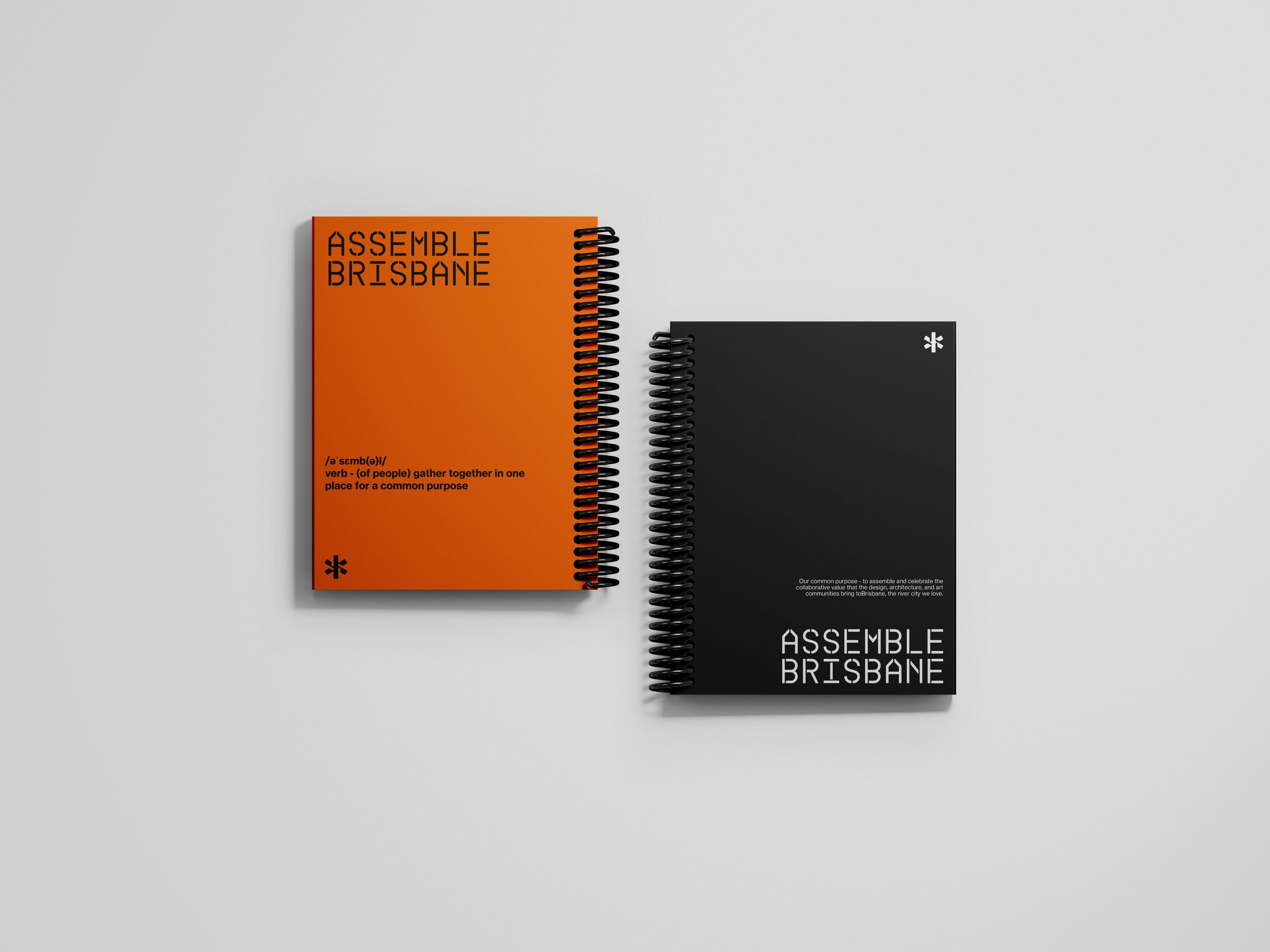
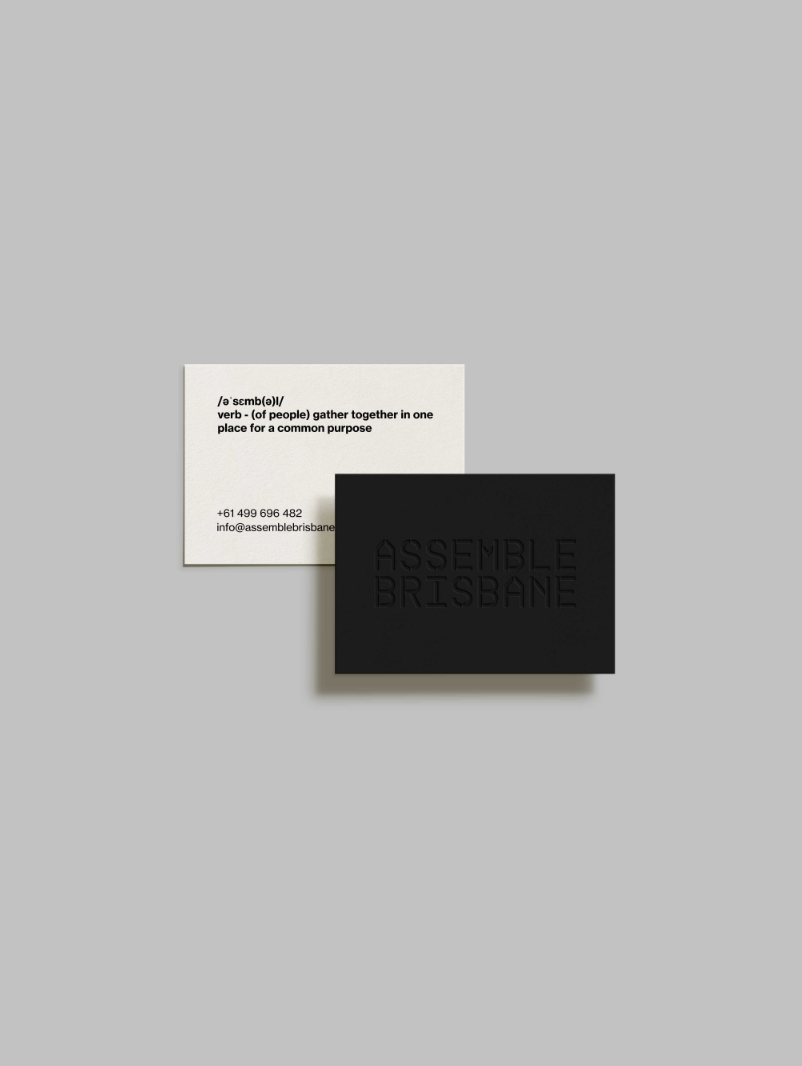
The asterisk (*) was chosen as the brand mark for Assemble Brisbane because it symbolises inclusivity, flexibility, and community - values that are central to the initiative.an asterisk (*)—both as the wildcard character and for proximity searches. The wildcard searches for variations in words (truncation), and can replace a whole word for proximity searches.
The asterisk also represents connection and the idea of linking different ideas and people together, much like how Assemble Brisbane connects the Art, Architecture, and Design communities in Brisbane.
Assemble Brisbane personality is simplicity, versatility, and symbolic value. We use The orange colour was chosen to represent energy, creativity, and warmth.
The typography chosen was modern and clean, with sans-serif fonts that were easy to read and reflected the initiative's contemporary approach. The branding solution also included guidelines for imagery, tone of voice, and other visual elements to ensure consistency across all communication materials.
The website design was modern and user-friendly, with a clean layout and clear navigation. The website was designed to showcase the community's work and provide a platform for collaboration and communication.

The new logo for Assemble Brisbane features the asterisk symbol, which represents connection, inclusivity, and creativity. The asterisk is designed to be simple, versatile, and easy to recognize, making it an ideal brand mark for Assemble Brisbane. The logo also features the initiative's name in a clean and modern sans-serif font, creating a contemporary and professional look.
The brand guidelines and logo were designed to reflect Assemble Brisbane's values and personality and create a strong brand presence that would help the initiative stand out in the market. The guidelines and logo have been applied across all communication materials, including the website, social media, and other marketing materials, ensuring consistency and creating a cohesive brand identity.
Once we had a clear understanding of the community's needs and values, UNLMTD began to develop the brand guidelines. The guidelines included specifications for the logo, typography, colour palette, imagery, and tone of voice. The guidelines were designed to ensure consistency across all communication materials and create a strong brand identity for Assemble Brisbane.
The logo design process began with brainstorming and sketching ideas based on the research and insights gained during the research phase. The agency presented several logo concepts to the Assemble Brisbane team, and together they narrowed down the options and selected the final logo.
